Making it yours
Colors, type, spacing, how feeds behave, and what arrives by email. Nearly all of it lives on one settings page.
Everything on this page is under Settings, in your account menu at the bottom of the sidebar. The most-used controls are also in that menu directly, so you can change them without leaving what you are reading.
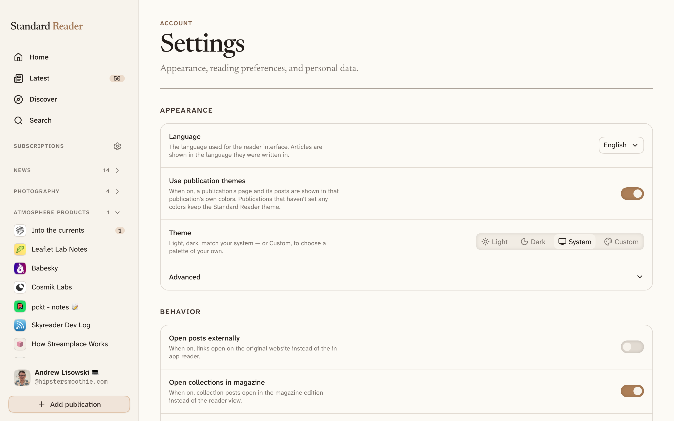
Light, dark, and custom colors
Theme offers light, dark, match-your-system, or Custom. Custom opens a set of eight hand-made palettes — four light, four dark — plus the option to name your own two colors: the paper the app is printed on and the accent used for links and buttons.
Everything else is worked out from those two. A palette decides for itself whether it is light or dark, so a custom theme stops following your system. If the accent you pick would be hard to read against your paper, the picker says so rather than quietly changing it — the color you chose is the color you get.
Type size, shape, and density
Four more dials sit under Appearance, and they apply in every theme — they are not color:
- Interface font — editorial, plain sans-serif, or any family from Google Fonts.
- Text size — five steps. This scales the whole app, not just the type: buttons, spacing, and panels grow with it.
- Roundness — how rounded corners are, from sharp to soft.
- Density — compact, default, or relaxed. This changes the space between things, never the size of the controls themselves.
Reading preferences
The Reading section governs article bodies only, on top of whatever the app-wide settings are: Text size, Column width — how many words fit on a line — and Body font, which takes a serif, a sans-serif, or any Google Fonts family you search for.
Listen aloud voice is here too. Left on Auto, a voice is chosen to suit each author; otherwise pick one and it is used for everything.
Under Behavior: whether articles open on their original website instead of in the reader, whether collections open as magazine editions, whether your reading history is recorded, and whether a publication's whole back catalogue counts as unread the moment you subscribe to it.
Letting publications use their own colors
Use publication themes lets each publication paint its own page and articles in its own colors and fonts, the way its website looks. The sidebar and navigation stay in your theme, so you never lose your bearings, and publications that have not chosen any colors keep the standard look.
Feed preferences
Hide recommend and comment counts removes the numbers from article cards, lists, and bylines. You can still recommend an article — only the tallies go away. If counts make you read differently, this is worth trying.
Loading more chooses between infinite scroll and a Load more button that waits until you ask.
Under Sidebar, you can hide destinations you never use. Subscriptions and your own lists always stay.
The weekly digest
Turn on Weekly digest email and once a week you get a summary of what the publications you subscribe to have published, with a preview shown on the settings page before you commit. It is off unless you ask for it, and one setting turns it off again.
Moderation and labels
Standard Reader shows content from across an open network, so moderation is something you choose rather than something we decide for everyone. Labelers are independent services that mark content — spam, adult material, whatever they specialise in — and you subscribe to the ones whose judgement you trust.
Select Browse labelers to see what is available. Once subscribed, their labels appear as you read and can warn you, blur the content, or hide it entirely. Labelers you already follow on Bluesky carry over.
Language
Language at the top of Appearance changes the interface — menus, labels, and buttons. Articles are always shown in the language they were written in; nothing is translated.